Digital Menu Design: 6 Themes in Light and Dark (2026)
Six digital menu designs shown on a real phone, each in light and dark: which one fits your restaurant, when to use photos and how to switch in a minute.
In this article
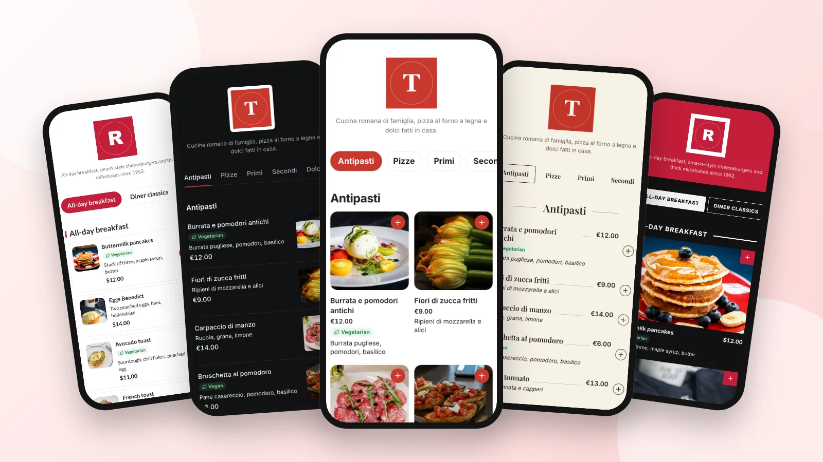
Good digital menu design is about one thing: a guest holding a phone at your table should find a dish and its price in a second. That comes down to a layout that matches what you have (photos or not), readable type, one accent color and enough contrast. Below are six ready-made designs, each shown in light and dark on a real phone, with when to use which.
They are the six themes in Acuolina's menu builder, and they work for cafés, bars and shops as well as restaurants. You pick one, choose your color and a light or dark background, and your QR code menu changes at once, with the same link and the same QR code on your tables.
What you'll get
- Six digital menu designs side by side, in light and dark.
- A quick rule for picking yours in under a minute.
- When a dark menu works, and when it doesn't.
- How to switch your menu's design without reprinting anything.
How do you choose a digital menu design?
Start from your menu, not from a mood board. Four questions settle it:
- Do most dishes have a photo? Yes: a photo grid (Photo or Asian). No: rows or a printed card (Minimal, Bistro, Classic).
- Is your menu long? More than about 40 dishes reads best as rows, with section chips at the top to jump around.
- When do people eat? Bars and dinner places with low light: try the dark background, or Neon, which starts dark. Breakfast, lunch and terraces: light.
- What's your brand color? Use it once, as the accent on buttons and the current section, and keep the rest calm.
| Theme | Best for | Photos | Look | Extras |
|---|---|---|---|---|
| Classic | Any menu, a safe start | Small thumbnails | Rounded cards, Lato | — |
| Minimal | Cafés, text-heavy menus | Optional, at the side | Clean rows, Inter | Very quiet |
| Photo | Burgers, brunch, desserts | Big grid | Photos first, Inter | Hero photo in the dish popup |
| Bistro | Trattorias, wine bars, fine dining | Off by default | Printed card, Playfair Display | Dotted lines to the price |
| Asian | Sushi, noodles, kebab, fast food | Cards or rows | Bold capitals, square | Numbered dishes |
| Neon | Bars, diners, cocktail and late-night places | At the end of each card | Glowing signs, Tilt Neon | Dark by default |
What does each menu design look like?
Each image shows the same theme on a light background (left) and a dark one (right), drawn by the real public menu with sample restaurants.
Classic: cards for any menu
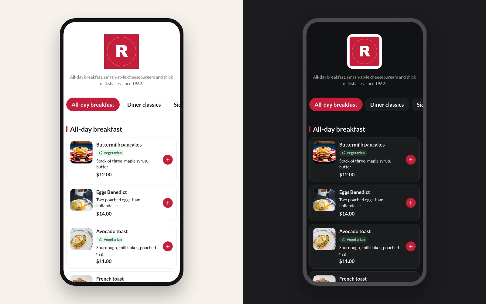
Rounded cards with a thumbnail, the description and the price, and a round "+" in your color. It works with or without photos, which makes it the right default when you don't know where to start. It is what every Acuolina menu has always looked like.
Minimal: clean rows, text first
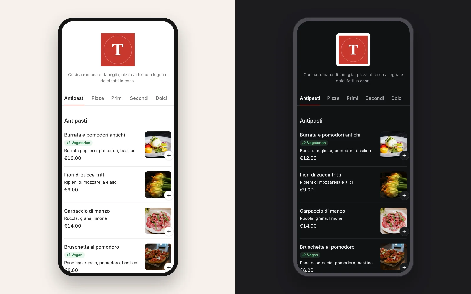
No cards: dishes are rows split by hairlines, with the photo, when there is one, as a small square at the end. Section tabs are plain text with a thin underline in your color. It suits cafés, bakeries and long menus where guests read more than they look.
Photo: a grid of big photos
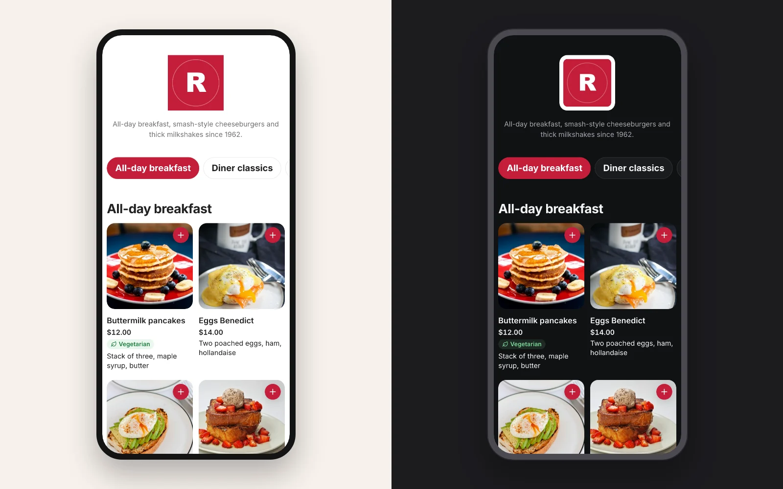
Two columns of square photos on phones (up to four on a large screen), with the name and price under each one. Opening a dish shows its photo edge to edge at the top of the popup. Use it when your food sells itself: burgers, brunch, poke, cakes. If fewer than half of the dishes have a photo, the theme shows cards instead, so you never get a grid of empty tiles.
Bistro: elegant, like a printed card
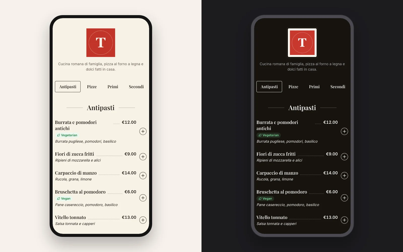
Warm paper, serif titles in Playfair Display, and a dotted line from each dish to its price, like the menu card of a good trattoria. Photos are off by default (you can turn them on, and the dish popup still shows them). Buttons are ink instead of your color, so it stays quiet. Made for trattorias, wine bars, bistros and tasting menus.
Asian: bold, graphic and numbered
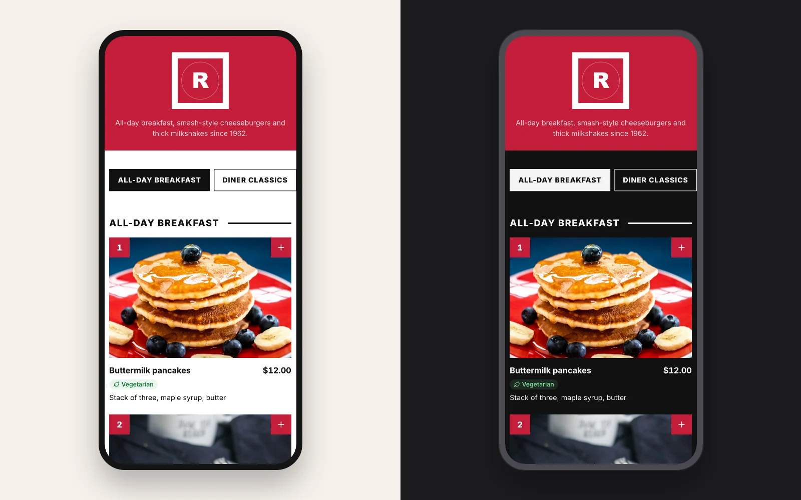
A full-width band of your color behind the header, square chips in capitals and thick black lines under the section names. Every dish gets a number, from 1 through the whole menu, shown on the card, in the dish popup and in the guest's cart. Numbers make ordering faster when dish names are long or in another language, which is why sushi, noodle, Chinese and kebab menus use them. The number is for display only: your order message stays the same.
Neon: glowing signs for the night
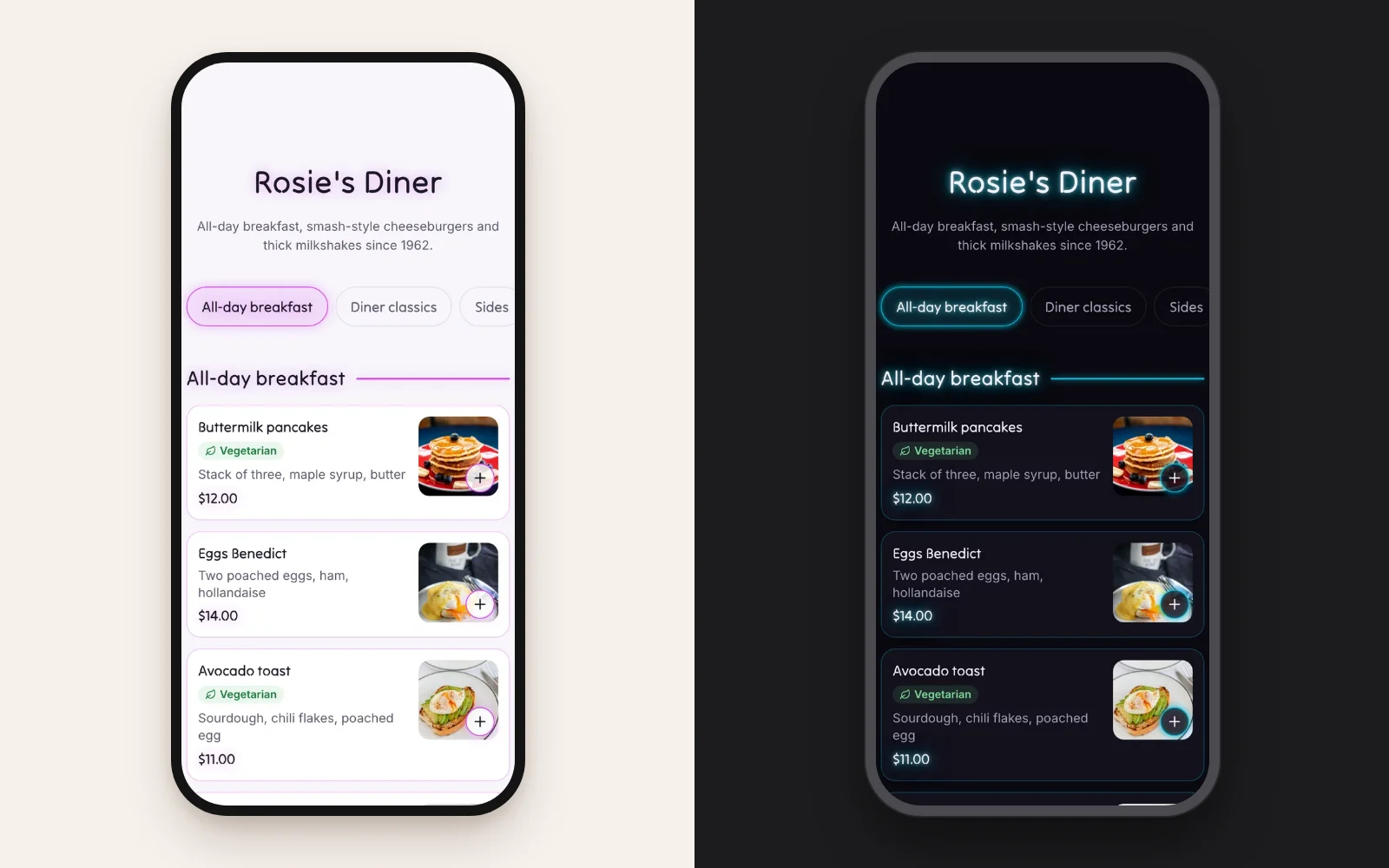
The restaurant name, the section titles and the prices glow in your color, like neon signs over a bar, with titles in Tilt Neon. Each dish is a card with a faintly lit border, the photo at the end and the "+" as a lit ring. It is the only theme that starts on a dark page, and it has a light version, a pale violet page where the glow turns soft. Made for bars, diners, cocktail bars and late-night places.
Should a digital menu have a dark mode?
Sometimes. A dark background looks good in bars, cocktail places and dinner restaurants with low light, where a white screen at the table feels like a flashlight. In daylight, on a terrace or at breakfast, light reads better.
The risk with dark menus is contrast: grey text on black and a dark brand color on a dark page are hard to read. Accessibility guidelines ask for at least 4.5:1 for text and 3:1 for buttons and icons. On the dark background Acuolina brings your accent color to at least 3:1 against the page by itself, so a deep red or navy brand still gives visible buttons, chips and "+" icons. Each theme has its own dark page, too: Bistro's is a warm near-black, not pure black.
Do photos make a menu sell more?
Photos help guests pick dishes they don't know, but only if they are good and if most dishes have one. A grid where half the tiles are empty looks unfinished, and a dark, blurry photo hurts more than no photo. Three rules:
- All or most. Use a photo layout only when at least half your dishes have a photo. Acuolina's Photo and Asian themes check this and fall back to a list.
- Same light, same angle. Shoot in daylight from the same angle, so the grid looks like one menu.
- Star dishes first. No time for everything? Photograph your best sellers and use Classic or Minimal, which look fine with gaps.
No photos at all? Bistro and Minimal look complete with text only. For what to write instead, see our guide to menu descriptions that sell.
Do these designs work for cafés, shops and other businesses?
Yes. A menu is a list of items with prices, so the same six themes work for any place that sells from one: cafés, bakeries, bars, food trucks, ice cream shops, and stores that take orders on WhatsApp, like florists, cake and gift shops, butchers or small grocers.
| Business | Theme | Why |
|---|---|---|
| Café or bakery | Minimal | Many small items with short names |
| Florist, cake or gift shop | Photo | Customers buy with their eyes |
| Wine or cocktail bar | Bistro, dark | Reads like a printed list in low light |
| Late-night bar, diner or burger joint | Neon | Glows like a sign in a dark room |
| Butcher, grocer or deli | Classic | Long lists, with or without photos |
| Takeaway with a long menu | Asian | Numbers make phone and WhatsApp orders faster |
For a shop, the menu becomes a catalog: sections are categories, dishes are products, and orders arrive on your WhatsApp the same way. See how in our guide to a digital catalog for shops.
How do you change your menu's design?
It takes about a minute, and nothing you've printed changes:
- In your dashboard, open Style.
- Pick a template: Classic, Minimal, Photo, Bistro, Asian or Neon. The preview shows your own menu.
- Choose your color (the logo's colors are suggested) and a light or dark background.
- Turn dish photos on or off, then Save.
Your menu link and QR code stay the same, so guests see the new design the next time they scan. Your color saves on every plan; the themes, the dark background and the photo choice are part of Chef. On Basic you can still try every combination in the preview before deciding. See the pricing for what each plan includes.
What else makes a digital menu easy to use?
Design is half of it. The other half is what's in the menu:
- Short sections in eating order, with chips at the top to jump between them.
- Short descriptions: what's in it and how it's cooked, in one line. Our restaurant menu template has a formula.
- Allergens on every dish, shown under the name. Start from our allergen menu template.
- Ordering from the same page, so guests who decide can order to your WhatsApp or by text, with no commission. See QR code table ordering.
- A QR code that's easy to scan, printed big enough for the table. Comparing tools? See free QR code menu options.
Next step
- New to digital menus? Start with digital menus for restaurants.
- Want more orders from it? Read how to increase restaurant sales.
- Moving off a delivery app? Read commission-free online ordering.
Ready? Create your menu and try all six designs free for 14 days. More guides are in menu design.
Frequently asked questions
What is the best design for a digital menu?
The one your guests can read in a second on a phone. Pick it by what you have, not by taste alone. With a photo for most dishes, a photo grid sells best. With few photos, clean rows or a printed-card look read better. A single accent color and plain prices work in every design.
Should my digital menu have a dark mode?
A dark background suits bars, cocktail places and restaurants with dim evening light, where a white screen feels too bright, and the Neon theme is built for it. In daylight and on a terrace, light is easier to read. In Acuolina each of the six themes comes in both, and your accent color is adjusted on dark so buttons stay visible.
Do I need my own photos for a good-looking menu?
No. Minimal, Bistro and Classic look finished with text only, and Bistro hides photos by default. The Photo and Asian themes switch to a list by themselves when fewer than half of your dishes have a photo, so the menu never shows a grid full of gaps.
Can I use my brand color on the free plan?
Yes. Your accent color saves on every plan, including Basic. The six themes, the dark background and the photo choice are part of Chef, and you can try all of them in the Style page before you decide.
Does changing the design change my QR code?
No. The theme only changes how the menu looks. The link and the QR code on your tables stay the same, so you can switch as often as you like without reprinting anything.
Do guests need an app to see the menu?
No. They scan the QR code and the menu opens in the phone's browser, in the design you chose, and they can order from it if you take orders.
Can a shop or café use these menu designs?
Yes. The themes work for any list of items with prices, so cafés, bakeries, bars, florists, gift shops and grocers use them for their catalog, and take orders on WhatsApp the same way restaurants do.
Keep reading
Menu design
Restaurant Menu Template: Free and Ready to Copy (2026)
A free restaurant menu template to copy into Word or Google Docs, with a filled-in example, description formulas, print layouts and a spot for your QR code.
QR menus
Digital Menu for Restaurants: The 2026 Guide
What a digital menu is, what it costs, how it differs from menu screens, and how to set one up with QR codes and commission-free ordering.
QR menus
QR Code Menu: How to Make One in 6 Steps (2026)
How to make a QR code menu in 6 steps: what to put on it, where to place the code, the mistakes that send guests back to paper, and how to take orders.
Your first direct order, tonight.
Create your menu in minutes and get every Chef feature free for 14 days. Then stay on Basic for free, or upgrade.